
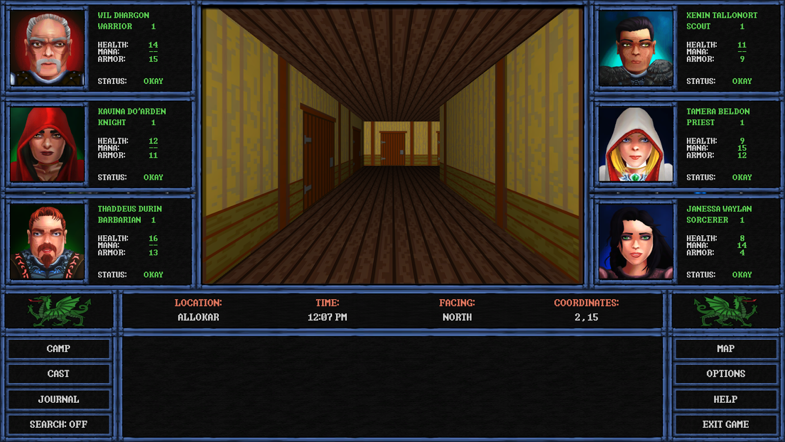
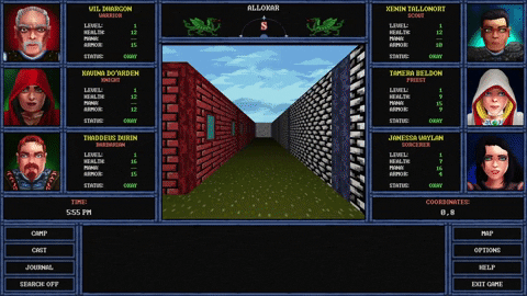
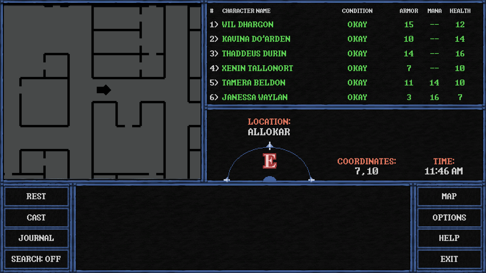
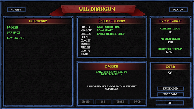
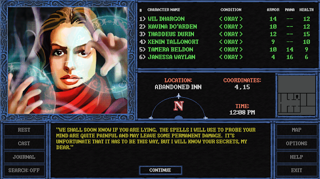
If you go with this design I think the portraits do work better than the tokens. The original style with the list of names is more gold boxey though if thats the vibe you're after. I'd be happy with it either way to be honest. If you're worried about it, stick with your original vision.
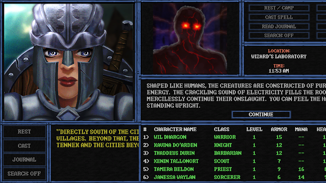
Edit: on reflection, I think the version with the portraits looks a bit nicer and more professional. I'd probably go with it. But stick to the vision as you see it.
Edit2: maybe bring the map/camp etc boxes into the same space though rather than on either side of the screen? Or would that totally upset the visual balance? Not sure. Actually, probably fine as it is, I guess the ones on the right are mainly functional and the ones on the left are gameplay.
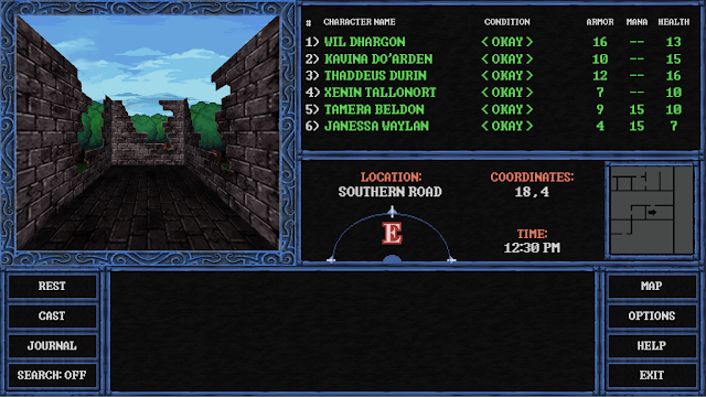
Last edited:


")