Magic & Mercenaries: Curse of Eternal Darkness

If you go with this design I think the portraits do work better than the tokens. The original style with the list of names is more gold boxey though if thats the vibe you're after. I'd be happy with it either way to be honest. If you're worried about it, stick with your original vision.

Edit: on reflection, I think the version with the portraits looks a bit nicer and more professional. I'd probably go with it. But stick to the vision as you see it.

Edit2: maybe bring the map/camp etc boxes into the same space though rather than on either side of the screen? Or would that totally upset the visual balance? Not sure. Actually, probably fine as it is, I guess the ones on the right are mainly functional and the ones on the left are gameplay.
 
Last edited:
Joined
Apr 13, 2012
Messages
1,901
Location
UK
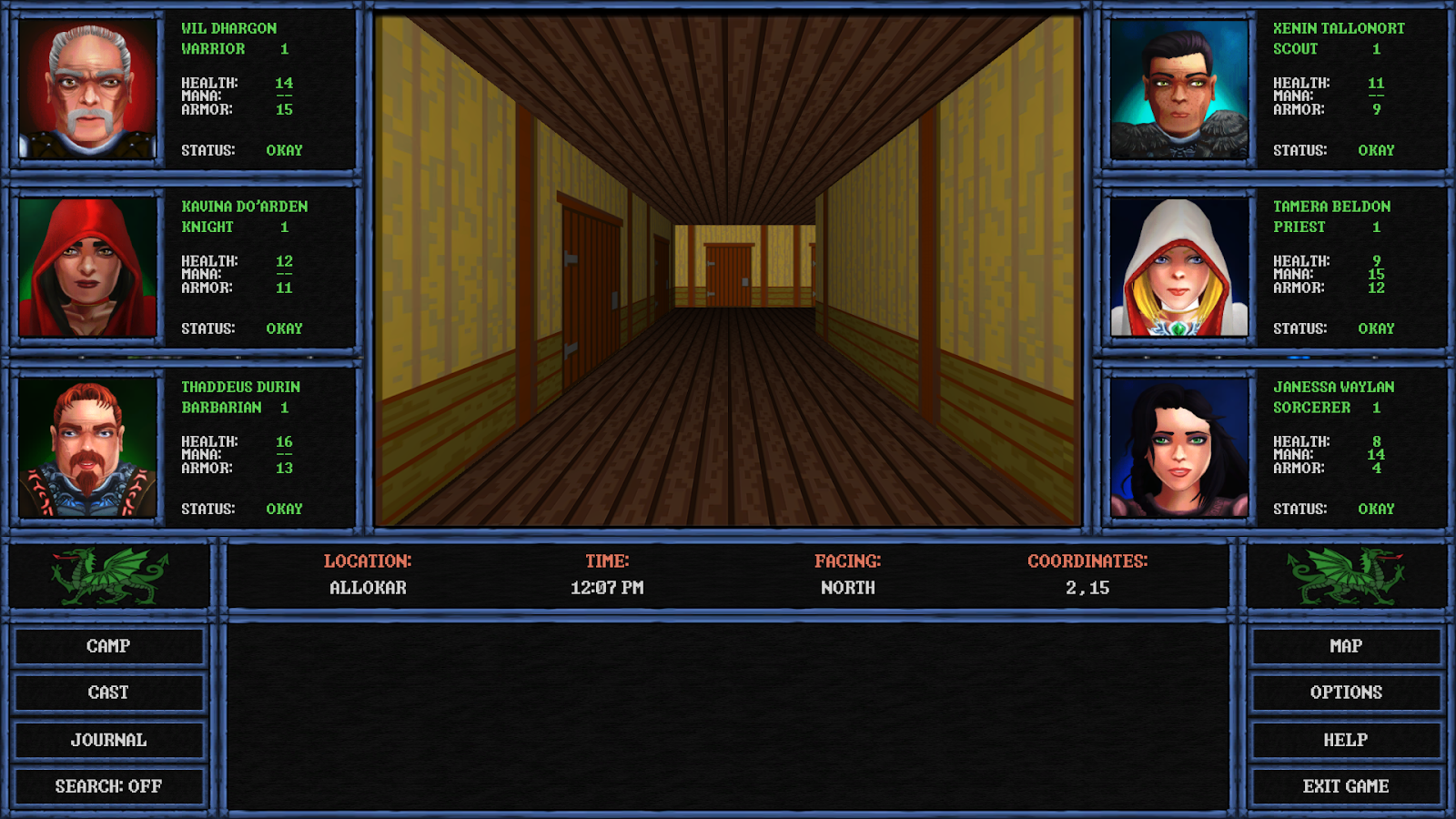
As an update, the layout is shaping up quite nicely and looks like this today…

Screenshot%2B%252849%2529.png
 
Joined
Feb 20, 2013
Messages
129
Location
United States
Unforunately, I had to go back to the original layout. Turns out that while it started off looking fine, it ended up causing a ton of issues.

* The backgrounds broke in some resolutions, making them completely unusable. No idea why.
* As a result of the above, I had to change how the backgrounds worked, and there wasn't any way to make them look good.
* The increased resolution made the walls look terrible in some cases. They weren't made for a view quite that large.
* As a result of going to 16:9 a lot of other screens broke, including the combat screen, which was built around a 4:3 aspect ratio.

The change in the layout also meant more work if I were to pursue it, including:

* Creating new backgrounds for the ones that no longer worked.
* Creating new portraits for characters where they weren't previously needed.
* Creating all new walls to account for the bigger viewscreen.
* Recreating nearly all the screens in the game to work in 16:9.

At this point, I'm glad I only wasted two days worth of work instead of the months it would take to get all this stuff working as expected. Truth is, I'd rather just press forward with content development than end up rebuilding whole sections of the game from scratch. Besides, even though I know some people liked it, the game felt less like a Gold-Box game and more like a Wizardry clone.

Thanks for all the feedback from those that gave it. I probably should have waited a bit longer before posting about it and getting people's hopes up.
 
Joined
Feb 20, 2013
Messages
129
Location
United States
The original layout is fine so no problem here, and it's interesting to see your thought process in the game's development. I hope the process of analysing all this was helpful in some way. Look forward to the next update.
 
Joined
Apr 13, 2012
Messages
1,901
Location
UK
I guess I have a hard time letting things die. Instead, I decided to simply keep working with the new UI. The more I worked with it, the more problems I solved. The more problems I solved, the better the layout got, which lead to adding a few more advancements to the game.

Game now has a working compass graphic instead of just text. Skies now move instead of just remaining static (other tiles, like water, also move). I'm playing around again with the idea of putting torches in the game to make the day/night cycle and the dark dungeons a bit more realistic. The 3D window is now twice the size it was in the original layout and is in the center of the screen, which is quite comfortable to look at.

All of it is subject to change, of course. But, here's an animated GIF anyway…

giphy.gif


I can still go back to the original layout at a moment's notice, but this is growing on me quite a lot. Not sold on the torches yet, though.
 
Joined
Feb 20, 2013
Messages
129
Location
United States
I went back to the original layout.

I don't have time to fight with people over what's the right way to get the job done or how big certain windows are or whatever dumb thing they think that really doesn't matter when it comes to a CRPG. My original layout is similar to the Gold-Box games, which was intentional from the start. Those who get it and understand what I'm going for will like the game and those that don't can pass on it. Personally, I think some people have some really shallow criteria and I never should have let them get into my head to begin with.

Just to be clear, this is not a reference to anyone on these forums. Everyone here has been great.
 
Joined
Feb 20, 2013
Messages
129
Location
United States
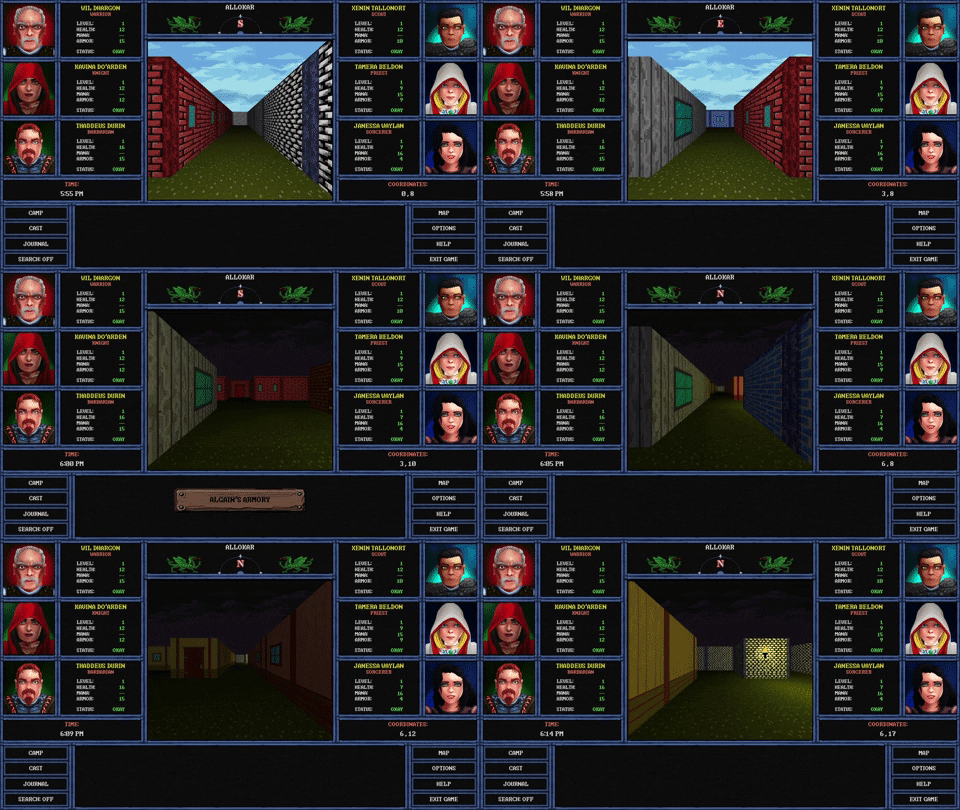
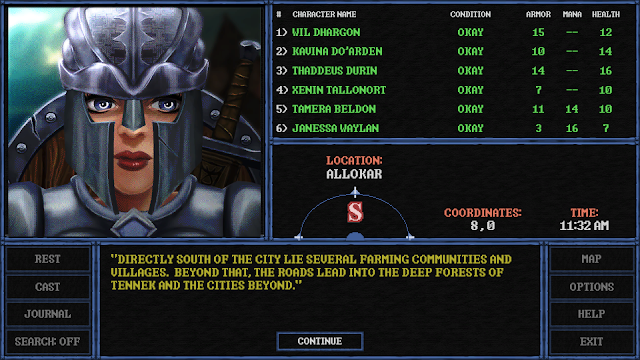
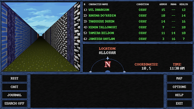
After thinking about it, I did something different with the widescreen layout so that it more resembles the original Gold-Box games. Here are some screenshots...

Screenshot%2B%252851%2529.png


Screenshot%2B%252852%2529.png


Screenshot%2B%252853%2529.png


And here is a comparison of the new layout versus the original, showing that the exploration/image window is twice the size it once was...

ScreenshotComparison.png
 
Joined
Feb 20, 2013
Messages
129
Location
United States
Are you going with the large exploration window on the left upper as in the gold box games? If so, that looks really excellent.
 
Joined
Jun 18, 2019
Messages
103
Looks like you have landed with a really good solution. I think it will keep everyone happy, good work!
 
Joined
Oct 18, 2006
Messages
3,121
Location
Sigil
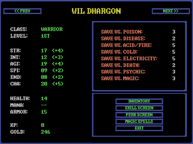
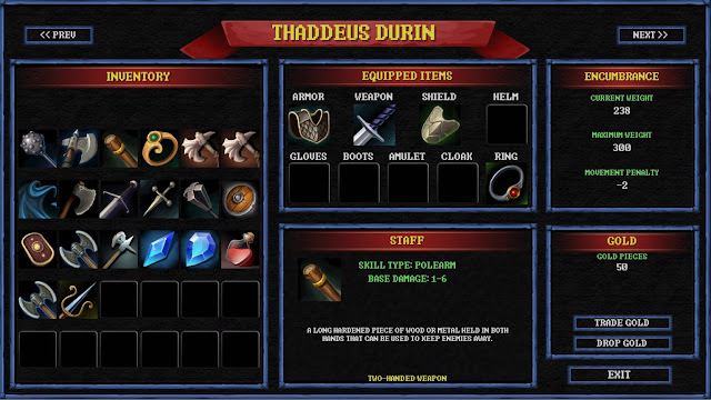
Updating some aspects of the GUI. I suppose not everything needs to be stuck in 1990.

Old character screen:
OldSheet.png


Updated character screen:
NewSheet.jpg


Old inventory screen:
OldInventory.png


Updated inventory screen:
NewInventory.jpg
 
Joined
Feb 20, 2013
Messages
129
Location
United States
Nice changes; I like.
 
Joined
Aug 31, 2006
Messages
12,825
Location
Australia
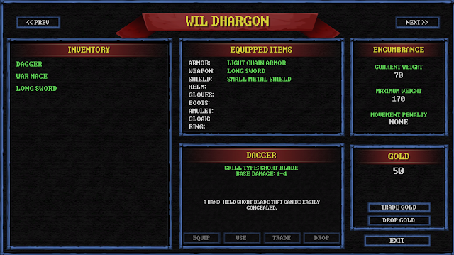
Been a while since I last updated. Work has continued to progress, but I had to roll back the changes I made to the inventory system and went back to a text-based system. There were a lot of reasons for this.

2020-05.png


Aside from that, progress is still being made. Here's a screenshot I took today...

2020-06.png
 
Joined
Feb 20, 2013
Messages
129
Location
United States
Text based inventory system works fine for me. Thanks for the update!
 
Joined
Apr 13, 2012
Messages
1,901
Location
UK
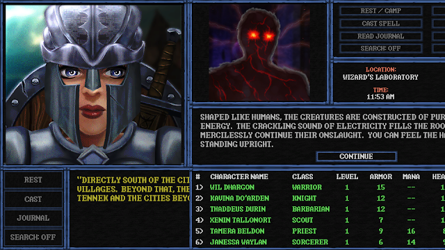
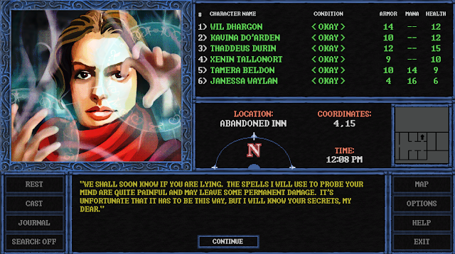
Probably the only thing better than a CRPG that allows choices is a CRPG that ties those choices to the skill system:

2020-09.png


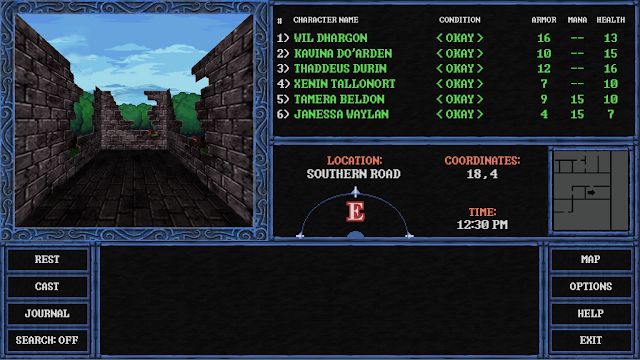
And just to make things interesting, here's a picture of the party exploring some ruins in the middle of the forest...

2020-08.png
 
Joined
Feb 20, 2013
Messages
129
Location
United States
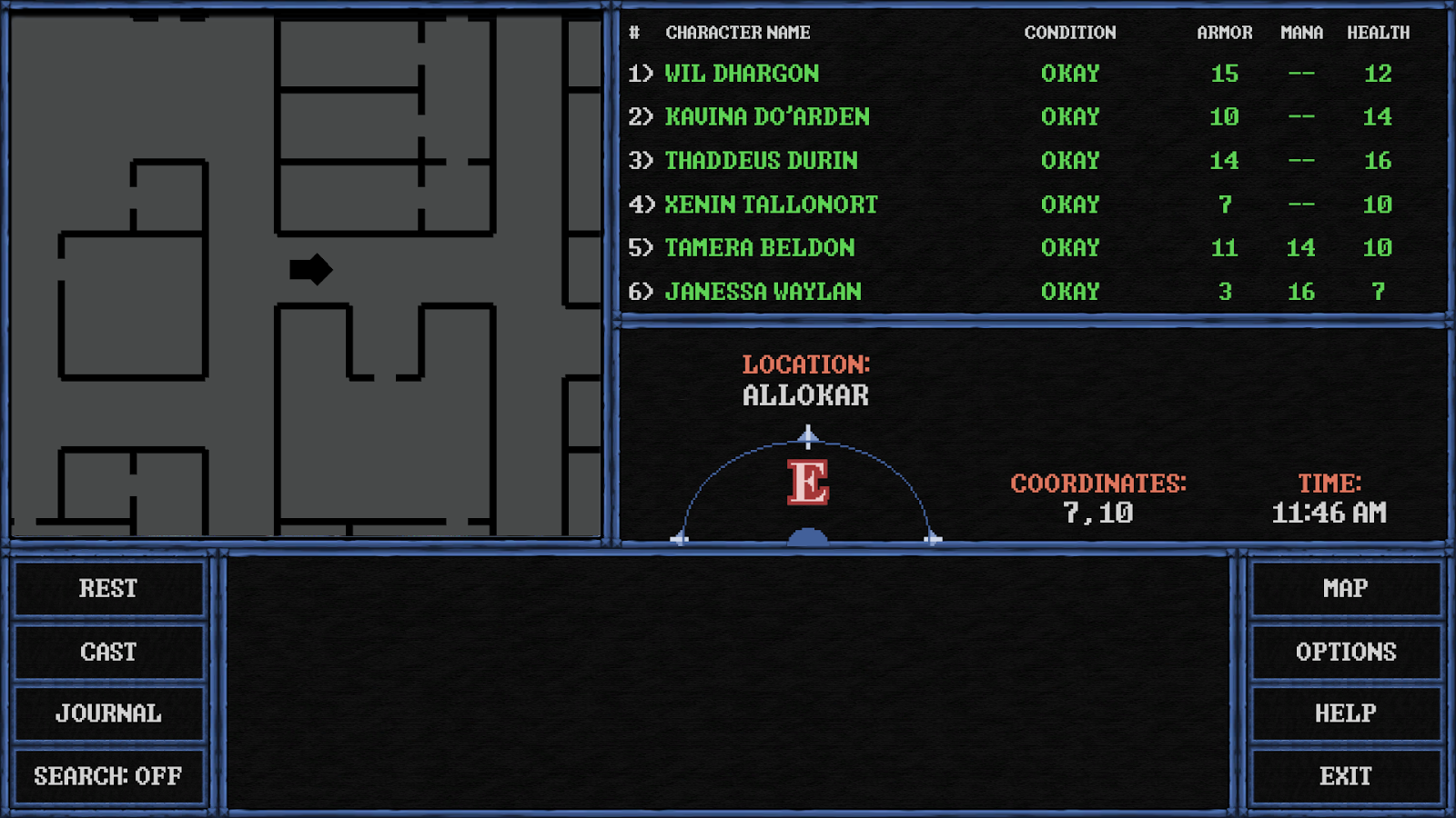
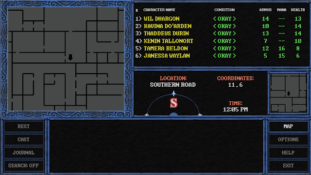
This screenshot shows the difference in the two mini-maps built into the game:

2020-10.png


The small mini-map on the middle left is always on. It moves with the party and shows you your current surroundings.

The larger mini-map, activated by the MAP button, shows a much wider view. The player cannot move while it is activated, but it allows you to take some time to get a better vantage point on what lies in your general vicinity. Useful in some situations where you might want to know what general direction to head to get to a specific point in a dungeon or something (like back to the exit).

BONUS:
This screen also shows that the characters have all gained enough experience and are ready to train to the next level. You will know when this happens when their name turns yellow instead of the usual green. (All this information will likely be documented in a manual that nobody will ever read once the game is released).
 
Joined
Feb 20, 2013
Messages
129
Location
United States
I'll have you know good sir that the first thing I like to do with any game is read the manual!! If you've read any of my game reviews here at the Watch you'd remember that I regularly decry the lack of a decent manual with many of the current games!! Ah for the good old days where a game manual was thicker than many novels!! :)
 
Joined
Aug 31, 2006
Messages
12,825
Location
Australia
Aye, those days made the games well more enjoyable for me, as well. Forget loading up the game first, I likely spent the first hour or so thoroughly reading the book enclosed, studying the design and getting an idea before even starting the game of what it was all about, beyond the simply concept. Man, those were the days!
 
Joined
Oct 18, 2011
Messages
18,983
Location
Holly Hill, FL.
I really miss a good printed manual myself. I loved sitting down and reading through them in detail!
 
Joined
Jun 4, 2008
Messages
3,971
Location
NH
Back
Top Bottom