P
purpleblob
Guest
I thought was BG2 portrait was much better than BG1 portrait. BG1 portrait was freaky... weird helms and marks.. and blurry.


None of above are original BG1 portraits, is there any place where they are?


")
I think BG2´s portraits were generally better than the BG1 ones, with one notable exception, I mean
->
What the hell was that?
What was definitely worse in BG2 were the inventory graphics and avatars, thankfully One Pixel Productions pack fixes that.
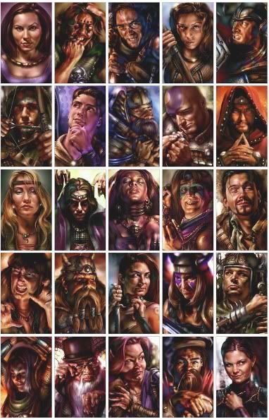
Lol ok but yes and not, those are reworked portraits, they wasn't made to be seen that big.Those are Jaheira's portraits from BG (on the left) and BG2.
You can find all the portraits and other stuff from Dudleyville-site.
At right size all BG1 are better, two examples quoted above, put them at right size, and no comparison, BG1 versions are much better. Not to mention how BG2 tend made them stupidly fancy, holy crap. Imoen is a perfect example of that, from a not beautiful but attaching Imoen in BG1 we get a brainless cold fancy Imoen in BG2.
Yay for being capped at level 9 or 13 when the humans can reach level 40
So you prefer the BG2 Minsc portrait? I wonder which modern game use such washed colors, well that's probably that modern graphics are ugly for you.In my previous post I had mostly in mind portraits for NPCs that were in both games - and in that case only Jaheira´s got worse imo…
I don't see at all like this, if in BG1 Imoen is the more faithful character to the PC, she has her character and the BG1 portrait makes feel it.I´ve never found the original Imoen´s portrait to be quite fitting with her personality, BG2´ s one, on the other hand, fits perfectly as I see it.
I totally disagree about Imoen, for Viconia, the BG2 graphic has more character and is more faithful to the character despite the washed colors.I agree with "stupidly fancy" bit though - with exceptions of Imoen and Viconia, all other female BG2 portraits are conceptually kinda awkward.
It's clear that took right from the game those graphics are too dark. But if they look like that in game then you didn't setup well the luminosity, and in game graphics was also too dark. I pickup original graphics, compensate the luminosity to show what you should get roughly in game and reduce the size to give a rough idea of in game graphics you get:BG1 ones don´t contain any of this conceptual awkwardness, but they´re problematic stylistically - they´re often too dark and indistinct which becomes obvious, well, when you put them at the right size.